Feb 14, 2026

What if the problem with your GLP-1 protocol is not the medication itself, but the fact that you cannot see what it is doing inside your body? You inject once a week. You wait. Maybe you feel something. Maybe you do not. And the whole time, you have no idea whether your medication levels are climbing, plateauing, or bouncing around like a ping pong ball between doses.
That uncertainty drives people to make bad decisions. They increase doses too quickly because they feel nothing at week two. They panic when side effects spike after a dose increase, not realizing the previous dose is still building in their system. They switch medications entirely when the real issue was timing, not the compound itself.
A GLP-1 plotter changes everything. This tool takes the invisible and makes it visible, mapping out exactly how much semaglutide, tirzepatide, or retatrutide is circulating in your system at any given moment. It plots concentration curves based on real pharmacokinetic data, showing peaks after injection, troughs before your next dose, and that gradual accumulation pattern that makes week five feel completely different from week one. Whether you are just starting your GLP-1 journey, planning a microdosing protocol, or trying to understand why side effects appeared out of nowhere, this guide covers everything you need to know about GLP-1 plotters. SeekPeptides has analyzed the major plotter tools, the pharmacokinetic science behind them, and the practical strategies that turn raw data into better outcomes.
What is a GLP-1 plotter and why does it matter
A GLP-1 plotter is a free online tool that calculates and visualizes the concentration of GLP-1 receptor agonist medications in your body over time. Think of it as a flight tracker for your medication. Instead of watching a plane cross a map, you watch your semaglutide or tirzepatide levels rise after each injection, gradually decay through the week, then build again with your next dose.
The concept sounds simple. It is not.
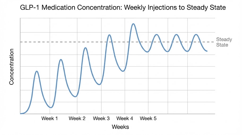
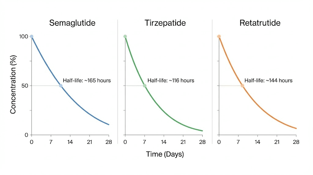
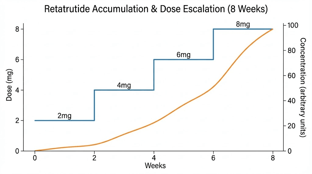
GLP-1 medications have long half-lives. Semaglutide sticks around for about seven days. Tirzepatide lingers for roughly five. Retatrutide holds steady for approximately six. These long half-lives mean that when you inject your second dose, a significant portion of your first dose is still circulating. By week three or four, you have overlapping layers of medication building toward what pharmacologists call steady state, the point where the amount entering your system equals the amount being eliminated.
Without a plotter, this accumulation is invisible. You cannot feel the difference between 40% of steady state and 85% of steady state. You just know that some weeks feel different from others, and you have no framework for understanding why.
The core problem plotters solve
Here is a scenario that plays out thousands of times every week. Someone starts compounded semaglutide at 0.25 mg weekly. After two weeks, they feel almost nothing. No appetite suppression. No nausea. No weight change. So they bump up to 0.5 mg, thinking the lower dose was not working.
What they do not realize is that at week two, they have only reached about 50-60% of their eventual steady state concentration at that dose. The medication was still building. Had they waited another two to three weeks, the full effects would have emerged without any dose increase at all.
Now compound the error. They moved to 0.5 mg while still accumulating 0.25 mg levels. The overlap creates a temporary spike that exceeds what either dose would produce alone. Suddenly nausea hits hard. They assume side effects are unavoidable at this dose and either white-knuckle through it or drop back down, losing weeks of progress.
A plotter would have shown all of this in advance.
Who benefits from using a GLP-1 plotter
The short answer is everyone taking these medications. But certain groups benefit more than others.
People using compounded medications benefit enormously because they have flexible dosing options that branded pens do not offer. When you can choose any dose amount rather than being locked into predetermined increments, the ability to visualize the impact of each choice becomes critical. Someone splitting their weekly dose into twice-weekly injections, for example, can use a plotter to see how that changes their peak and trough pattern compared to a single weekly shot.
People who are switching between medications benefit because the transition period involves two overlapping decay curves. A plotter shows exactly when the old medication clears enough for the new one to take primary effect.
Researchers exploring microdosing protocols benefit because small dose adjustments create subtle concentration changes that are impossible to feel but clearly visible on a graph. And anyone experiencing unexpected fatigue, headaches, or anxiety can correlate symptoms with concentration peaks to determine whether their issues are dose-related or something else entirely.
Understanding the pharmacokinetics behind the plotter
You do not need a pharmacy degree to use a GLP-1 plotter. But understanding a few key concepts transforms the experience from "looking at a squiggly line" to "making informed decisions about your protocol."
Half-life explained simply
Half-life is the time it takes for half of the medication to be eliminated from your body. That is it. Nothing more complicated than that.
If you inject 1 mg of semaglutide (half-life of approximately seven days), here is what happens. After seven days, 0.5 mg remains. After fourteen days, 0.25 mg remains. After twenty-one days, 0.125 mg remains. The medication never truly reaches zero. It just gets smaller and smaller until the amount is pharmacologically irrelevant.
Now here is where things get interesting for tirzepatide users. Tirzepatide has a shorter half-life of about five days. That means it decays faster between doses. The practical impact is that tirzepatide users experience slightly wider swings between their peak concentration (right after injection) and their trough concentration (right before the next dose) compared to semaglutide users, whose longer half-life creates a smoother curve.
Retatrutide sits in the middle at approximately six days. Its triple-receptor activity (GLP-1, GIP, and glucagon) adds another layer of complexity, but the pharmacokinetic principle remains the same.
The plotter uses these half-life values as the mathematical engine driving every curve it draws.
Steady state and why it takes 4-5 weeks
Steady state is the pharmacokinetic holy grail. It is the point where your weekly injection adds exactly the same amount of medication that your body eliminates in that same week. Peaks and troughs still exist, but they stabilize at predictable, consistent levels.
The math is straightforward. Steady state occurs after approximately 4-5 half-lives of consistent dosing.
For semaglutide with its seven-day half-life, that means roughly 28-35 days, or four to five weeks. For tirzepatide with its five-day half-life, steady state arrives slightly sooner, around 20-25 days. For retatrutide at six days, expect about 24-30 days.
This explains one of the most common frustrations with GLP-1 therapy. People expect immediate results because they know the medication is in their body. They can feel the injection site. Maybe mild nausea appears. But the full therapeutic effect, the appetite suppression, the metabolic changes, those require steady state concentrations. And steady state requires patience.
A plotter makes this patience easier by showing you exactly where you are on the accumulation curve. When you can see that you are at 65% of steady state on day 18, you understand why the effects are not yet at full strength. You are not broken. The medication is not failing. The physics of pharmacokinetics simply require more time.
Accumulation and why dose increases feel stronger than they should
This is the concept that catches almost everyone off guard.
When you increase your dose, the effective concentration in your body is not simply the new dose amount. It is the new dose plus whatever remains from your previous doses.
Here is a concrete example. You have been taking 2 mg of retatrutide weekly for several weeks and have reached steady state. Your body eliminates roughly 2 mg worth of medication each week. Now you increase to 3 mg. Your body is still calibrated to eliminate at the rate matching your old dose. That first week at 3 mg, there is still approximately 1 mg remaining from the previous dose. So your body effectively has about 4 mg worth of medication circulating, not 3 mg.
Week two at 3 mg is even higher, because the accumulation from the first 3 mg dose has not fully resolved. It takes another 4-5 half-lives at the new dose to reach a new steady state.
This overlap effect explains why dose increases often produce side effects that seem disproportionate to the size of the increase. Going from 2.5 mg to 5 mg of tirzepatide does not simply double your medication levels. During the transition period, your peak concentrations temporarily exceed what even the higher dose would produce at steady state.
A plotter shows this phenomenon clearly. You can see the temporary spike during dose transitions and understand that it will resolve as the new steady state establishes itself over the following weeks.
Peak and trough levels
Every weekly injection creates a peak (the highest concentration point, usually 8-72 hours after injection depending on the medication) and a trough (the lowest point, right before your next injection).
The difference between peak and trough matters more than most people realize. A wider peak-to-trough ratio means your body experiences more variation throughout the week. Some people feel this as a pattern: strong appetite suppression for three or four days after injection, followed by increasing hunger as levels drop toward the trough.
Semaglutide produces a relatively narrow peak-to-trough ratio because of its long seven-day half-life. By the time your next dose arrives, you still have roughly 50% of the previous dose in your system. Tirzepatide, with its shorter five-day half-life, shows wider fluctuations. After seven days, only about 38% remains.
This is precisely why some compounded medication users choose to split their weekly dose into two smaller injections. Taking half your weekly dose every 3.5 days creates a much flatter concentration curve with smaller peaks and smaller troughs. The total weekly medication remains identical, but the delivery pattern changes dramatically. A plotter lets you model both approaches side by side and see exactly how much smoother the twice-weekly protocol becomes.
How to use a GLP-1 plotter step by step
The tools vary in design, but the core workflow is nearly identical across every major plotter available online. Here is how to get meaningful data from your first session.
Step 1: select your medication
Every plotter starts by asking which medication you are tracking. The options typically include semaglutide (covering branded products like Ozempic and Wegovy, plus compounded formulations), tirzepatide (covering Mounjaro, Zepbound, and compounded versions), and increasingly, retatrutide.
Your medication choice determines which half-life value the plotter uses in its calculations. Select the wrong medication and every curve on your graph will be inaccurate. This sounds obvious, but it matters when people switch between medications and forget to update their plotter settings.
If you are using a compounded formulation, the pharmacokinetics remain the same as the branded version. The molecule is identical. The half-life does not change because the medication came from a compounding pharmacy rather than a brand-name manufacturer. What might change is the storage requirements and concentration of your vial, but those are reconstitution and dosing considerations, not pharmacokinetic ones.
Step 2: input your dosing schedule
Next, enter when you take your medication and how much. Most plotters offer several input methods.
The simplest approach is selecting a standard protocol. For semaglutide, that might be the standard Wegovy escalation: 0.25 mg for four weeks, 0.5 mg for four weeks, 1 mg for four weeks, 1.7 mg for four weeks, then 2.4 mg maintenance. The plotter automatically generates the entire curve.
For those using compounded medications with custom doses, manual entry gives you complete control. You specify each dose amount and the date administered. This is especially useful for people following microdosing schedules that do not follow standard escalation patterns.
Some advanced plotters let you set dose frequency beyond the standard once-weekly pattern. If you are splitting your dose into twice-weekly injections, you can specify that schedule and see the flattened concentration curve it produces. You can also model every-other-week dosing for maintenance phases, or even explore what happens if you miss a dose.
Step 3: read the graph
The output is a concentration-over-time graph. Time runs along the horizontal axis (typically in weeks). Relative concentration runs along the vertical axis.
An important note about that vertical axis. Most plotters show relative concentrations, not absolute blood levels in specific units. They cannot tell you "you have exactly 14.7 ng/mL of semaglutide in your blood right now." What they show is the proportional relationship between your current level and your eventual steady state level. This is still enormously useful because the shape of the curve, the peaks, troughs, and accumulation pattern, reflects real pharmacokinetic behavior.
Here is what to look for on your graph.
The sawtooth pattern. Each injection creates a sharp upward spike followed by a gradual decline. This sawtooth repeats weekly, creating the characteristic wave pattern. Over multiple weeks, notice how the troughs get progressively higher. That is accumulation building toward steady state.
The flattening zone. After 4-5 weeks at a consistent dose, the peaks and troughs stop climbing. They stabilize. Your graph transitions from an upward staircase pattern to a consistent wave. That is steady state.
The transition bumps. When you increase your dose, the graph shows a temporary acceleration in the accumulation pattern. Peaks jump higher than they will eventually settle at. Troughs climb faster. Then over the next 4-5 weeks, things smooth out again at the new, higher steady state.
Step 4: plan your protocol changes
This is where the plotter becomes a planning tool rather than just a tracking tool.
Before making any dose change, model it in the plotter first. Want to increase from 2.5 mg of tirzepatide to 5 mg? Input the change and observe the predicted concentration spike during transition. If the spike looks aggressive, consider an intermediate step at 3.75 mg first, something compounded medications make possible but branded pens do not.
Want to try splitting your dose into two injections per week? Model it. The plotter will show you the smoother curve with reduced peak-to-trough variation. You can then make an informed decision about whether the convenience trade-off (more frequent injections) is worth the pharmacokinetic benefit (more stable levels).
Considering switching medications? This is where plotters shine brightest. You can model the decay of your current medication alongside the buildup of your new one, finding the optimal timing for the switch that minimizes both gaps in coverage and overlap-driven side effects.
Major GLP-1 plotter tools compared
Several free tools exist, each with distinct strengths. Here is how they stack up for researchers and users exploring peptide protocols.
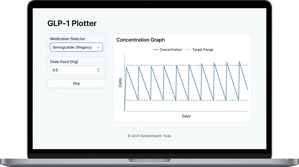
GLP1Plotter.com
Built and maintained by the r/Semaglutide Reddit community, this is one of the original plotters that helped popularize the concept. It supports semaglutide, tirzepatide, and retatrutide. The interface is straightforward: select your medication, input doses, and watch the graph populate in real time.
Strengths include its community backing (meaning bugs get reported and fixed quickly), support for multiple simultaneous compounds, and the ability to generate shareable links so you can show your graph to a healthcare provider or research partner. The tool also tracks total doses administered, average intervals, and adherence metrics.
The main limitation is that it uses population-average half-life values without adjustment for individual factors like body weight, kidney function, or age. But this is a limitation shared by every plotter currently available, because individual pharmacokinetic testing is not something these tools can replicate.
GLP1Calculator.com plotter
This tool is part of a broader calculator suite that includes dosage calculators and conversion tools. Its plotter focuses on visualization of semaglutide, tirzepatide, and retatrutide levels with particular attention to the dose increase planning feature. You can toggle a "dose increase" mode that lets you select which week to start a higher dose, and the plotter automatically adjusts the timeline.
The guide section on this site is particularly useful for beginners. It explains concepts like peak concentration, trough levels, and accumulation in plain language with visual examples. If you are new to pharmacokinetics, this is a good starting point.
GLP3Planner.com
This plotter distinguishes itself with strong retatrutide support and interactive charts that clearly show peak concentrations after each injection, trough levels before the next dose, and the gradual accumulation over weeks. It also offers dedicated resources for retatrutide dosing that go beyond what other plotters provide.
The escalation protocol feature allows you to build custom dose ramp-ups and see the pharmacokinetic consequences before committing to a schedule. This is particularly valuable for retatrutide users, given that the standard escalation protocol calls for relatively aggressive increases every four weeks.
Glapp.io plotter
Glapp positions itself as a comprehensive GLP-1 tracking platform. Its plotter compares tirzepatide and semaglutide doses, conversions, half-life patterns, and microdosing curves side by side. The comparison view is the standout feature here. If you are debating between two medications or two dosing strategies, being able to overlay both curves on a single graph eliminates guesswork.
Glapp also supports pen device selection (Ozempic, Wegovy, Mounjaro, Zepbound) alongside compounded medication inputs, making it accessible to both branded and compounded medication users.
GLP-1 Pilot and other app-based plotters
Several mobile applications now include plotter functionality alongside broader tracking features like weight logging, symptom recording, and meal planning. Shotsy and MeAgain are notable examples. These apps offer the convenience of mobile access and push notifications for dose reminders, but their plotter engines tend to be simpler than the dedicated web tools.
The trade-off is clear. Web-based plotters offer deeper pharmacokinetic modeling. App-based plotters offer better day-to-day tracking integration. Serious protocol planners often use both: a web plotter for strategic planning and an app for daily tracking.
Tool | Medications | Dose splitting | Comparison view | Best for |
|---|---|---|---|---|
GLP1Plotter.com | Sema, Tirz, Reta | Yes | Yes | Community support, sharing |
GLP1Calculator.com | Sema, Tirz, Reta | Yes | Limited | Beginners, education |
GLP3Planner.com | Sema, Tirz, Reta | Yes | Yes | Retatrutide users |
Glapp.io | Sema, Tirz | Yes | Strong | Medication comparison |
Shotsy/MeAgain | Sema, Tirz | Limited | No | Daily tracking, reminders |
Semaglutide on the plotter: what to expect
Semaglutide produces the smoothest curves of any GLP-1 receptor agonist, and the reason is pure math. Its seven-day half-life aligns almost perfectly with weekly dosing. After each seven-day interval, approximately 50% of the previous dose remains. This creates a natural accumulation pattern that builds gradually and predictably.
The standard escalation on a plotter
The Wegovy (weight management) protocol escalates as follows: 0.25 mg weekly for four weeks, then 0.5 mg for four weeks, then 1.0 mg for four weeks, then 1.7 mg for four weeks, and finally 2.4 mg as the maintenance dose.
When you plot this, several patterns emerge.
During the first four weeks at 0.25 mg, the graph shows concentration climbing in a staircase pattern. Each week adds more than the previous week because accumulation compounds. By week four, you are near steady state for that dose.
Then the jump to 0.5 mg creates a visible acceleration. The curve climbs faster because you are adding a larger dose on top of an already-established baseline. This is where many users first notice appetite suppression becoming more consistent, because the concentration has crossed the therapeutic threshold for that effect.
Each subsequent increase follows the same pattern: temporary spike, gradual stabilization, new steady state. The plotter shows you exactly when each transition phase resolves, typically four to five weeks after each increase.
Semaglutide-specific pharmacokinetic details
A few numbers that bring the plotter to life for semaglutide users.
Clearance rate is approximately 0.05 L/h in patients with type 2 diabetes. The medication binds heavily to albumin in the blood, which is what gives it that long seven-day half-life. Albumin binding protects semaglutide from metabolic breakdown and reduces renal clearance.
Injectable bioavailability is approximately 89%, meaning nearly all of what you inject reaches systemic circulation. Oral semaglutide (Rybelsus) has dramatically different pharmacokinetics, with bioavailability around 1%. This creates very different plotter curves. Oral users see more variation between doses because the within-subject variability in bioavailability is roughly 137% for individual doses. However, the long half-life smooths this out over time, reducing steady-state variability to about 33%.
For users tracking compounded semaglutide from 5 mg vials or 10 mg vials, the plotter behavior is identical to branded versions. The molecule does not care about the label on the vial.
What the plotter reveals about common semaglutide issues
Four weeks in with no weight loss? The plotter shows you are just reaching steady state at the lowest dose. The therapeutic level needed for meaningful weight loss usually requires higher concentrations.
Experiencing fatigue that peaks two days after injection? That correlates with the concentration peak, which typically occurs 24-72 hours post-injection. The plotter confirms that your symptoms align with the highest medication levels of the week.
Not losing weight despite dose increases? The plotter can reveal whether your current dose has actually reached steady state or whether you are still in the accumulation phase. Many people increase doses prematurely, never giving any single dose enough time to reach its full potential.
Withdrawal symptoms after stopping? The plotter shows the decay curve. Semaglutide does not disappear overnight. After your last injection, clinically relevant levels persist for three to five weeks. The plotter shows you exactly when levels drop below the therapeutic threshold, helping you anticipate when appetite may return.
Tirzepatide on the plotter: what to expect
Tirzepatide tells a slightly different story on the plotter, and the differences matter for practical protocol management.
The shorter half-life effect
With a half-life of approximately five days (more precisely, 5.4 days based on population pharmacokinetic studies), tirzepatide decays noticeably faster between weekly doses than semaglutide does. After seven days, roughly 38% of the previous dose remains, compared to about 50% for semaglutide.
On the plotter, this manifests as deeper troughs. The sawtooth pattern has taller teeth. Users sometimes describe this as feeling their medication "wear off" toward the end of the week, with appetite returning or energy dipping. The plotter confirms this is not imagined. The concentration genuinely drops more between doses.
Steady state still arrives after 4-5 half-lives, which works out to approximately 20-27 days, slightly faster than semaglutide. The accumulation factor at steady state is approximately 1.7-fold, meaning your trough level at steady state is about 1.7 times what it would be from a single dose.
The standard tirzepatide escalation
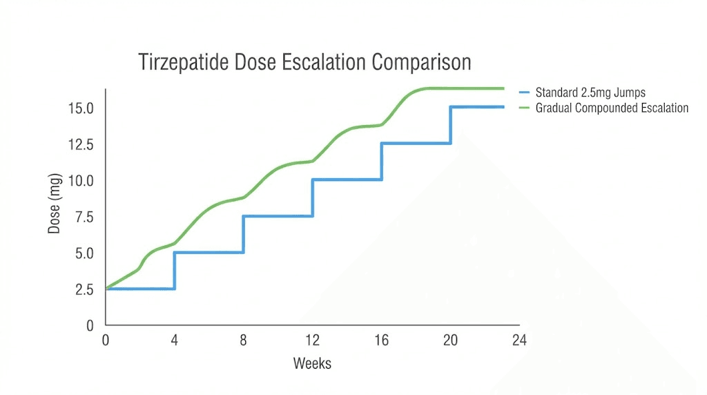
The approved Zepbound protocol starts at 2.5 mg weekly for four weeks, then increases by 2.5 mg every four weeks based on tolerability. Effective maintenance doses range from 5 mg to 15 mg.
Plot this and you see a different escalation pattern than semaglutide. The jumps are proportionally larger. Going from 2.5 mg to 5 mg is a 100% dose increase. Compare that to semaglutide's first escalation from 0.25 mg to 0.5 mg, also 100%, but at much lower absolute quantities.
This is why compounded tirzepatide users often prefer gentler escalation schedules. Instead of jumping from 2.5 mg straight to 5 mg, they might step through 3 mg, then 3.75 mg, then 5 mg. The plotter shows how these intermediate steps produce smoother concentration increases with less dramatic spikes during transitions.
Tirzepatide dose splitting on the plotter
Because of tirzepatide's wider peak-to-trough swings, dose splitting is particularly popular among compounded medication users. The plotter demonstrates why.
A single 5 mg injection once weekly creates a concentration curve with a peak approximately 1.6 times the trough. Two 2.5 mg injections spaced 3.5 days apart produce a curve where the peak is only about 1.2 times the trough. Same total weekly dose. Dramatically different experience.
Users who report fatigue, muscle pain, or intense nausea in the first few days after injection, followed by fading appetite suppression later in the week, are essentially describing the peak-to-trough cycle that the plotter visualizes. Dose splitting addresses both problems simultaneously: lower peaks reduce side effects, and higher troughs maintain appetite suppression throughout the week.
The dosage charts in units become especially important here, because splitting a dose requires accurate measurement. If your vial is reconstituted to a specific concentration, you need to know exactly how many units on your syringe correspond to half your weekly dose. The SeekPeptides dosage calculator can help with these conversions.
Tirzepatide-specific plotter insights
Peak plasma concentration occurs 8-72 hours after subcutaneous injection, with most users experiencing peaks around 24-48 hours. The medication is 99% protein bound to plasma albumin, which contributes to its relatively long half-life despite being shorter than semaglutide.
Clearance is approximately 0.061 L/hour, and the steady-state volume of distribution is about 10.3 liters. These numbers drive the plotter's calculations, though you never need to interact with them directly.
If you are considering dietary adjustments alongside your tirzepatide protocol, understanding when your peak concentration occurs can help you time meals strategically. Eating lighter on peak days (when appetite suppression is strongest) and slightly more on trough days (when appetite returns) can smooth out the nutritional experience while the plotter shows you the pharmacokinetic rationale behind the strategy.
Retatrutide on the plotter: the triple agonist difference
Retatrutide adds a fascinating new dimension to GLP-1 plotting because it activates three receptors rather than one or two. While the pharmacokinetic curve follows the same mathematical principles as semaglutide and tirzepatide, the clinical experience of that curve can feel quite different.
Retatrutide pharmacokinetics on the plotter
With a half-life of approximately six days, retatrutide sits between semaglutide (seven days) and tirzepatide (five days) in terms of weekly persistence. Its pharmacokinetics are dose-proportional, meaning doubling the dose roughly doubles the blood levels. This predictability makes plotter modeling particularly accurate for retatrutide.
Steady state arrives after approximately 24-30 days of consistent weekly dosing. The accumulation pattern on the plotter looks similar to semaglutide, with slightly deeper troughs due to the shorter half-life.
The standard escalation in phase 2 trials started at either 2 mg or 4 mg weekly, with increases every four weeks for up to 12 weeks, reaching maximum doses of 8-12 mg. When plotted, the 4 mg starting dose produces noticeably higher initial concentrations than starting at 2 mg, which is why the trial data showed more early gastrointestinal effects in the higher starting dose group.
Why retatrutide accumulation surprises people
The triple-receptor activity means that even at concentrations where semaglutide or tirzepatide might produce manageable effects, retatrutide can feel stronger per milligram. The plotter shows the same gradual accumulation curve, but the subjective experience at any given concentration point may be more intense.
This is why the plotter is arguably more valuable for retatrutide users than for any other GLP-1 medication. If you take 2 mg of retatrutide and feel minimal effects, increasing to 3 mg the following week means your body contains approximately 4 mg worth of the drug, not 3 mg. With a triple agonist, that extra milligram of accumulated medication activates three receptor systems simultaneously.
The plotter makes this accumulation unmistakably clear. It shows that patience during the first four to five weeks is not optional, it is pharmacokinetically required for any meaningful assessment of a given dose.
For detailed retatrutide dose schedules and reconstitution guidance, understanding the plotter output helps you match your preparation with your dosing plan. Knowing that your target steady-state concentration at 8 mg weekly will take a month to achieve helps you reconstitute the right amount and avoid waste.
Advanced plotter strategies for better outcomes
Once you understand the basics of reading a GLP-1 plotter, you can use it for sophisticated protocol planning that goes well beyond simple dose tracking.
Modeling dose transitions before making them
Never increase a dose blindly. Enter the proposed change into your plotter first and look at the predicted concentration spike during transition.
A useful benchmark: if the predicted peak during transition exceeds 150% of your current steady-state peak, consider an intermediate step. Most plotters let you experiment freely, so try several escalation rates until you find one that produces a smooth upward progression rather than dramatic spikes.
This is especially important for users of compounded tirzepatide and affordable tirzepatide who have the flexibility to dose in small increments. Branded pens lock you into specific dose steps (2.5, 5, 7.5, 10, 12.5, 15 mg for Mounjaro). Compounded vials let you adjust by fractions of a milligram, and the plotter shows exactly how those granular adjustments translate to concentration changes.
Using the plotter for medication switches
Switching from tirzepatide to semaglutide (or vice versa) involves overlapping pharmacokinetics. The outgoing medication decays while the incoming medication accumulates. A plotter that supports multiple simultaneous compounds lets you visualize both curves on a single graph.
The key question during any switch is: when does the new medication reach a therapeutically relevant concentration, and how much of the old medication is still present at that point?
If you stop tirzepatide on day zero and start semaglutide the same day, the plotter shows tirzepatide declining from its last peak while semaglutide begins its slow accumulation climb. For the first week or two, tirzepatide is still providing most of the GLP-1 receptor activation. By week three, semaglutide has accumulated enough to start carrying the load. The overlap ensures you never experience a complete gap in coverage.
The semaglutide to tirzepatide conversion chart and tirzepatide to semaglutide conversion chart articles provide dose equivalency guidance that pairs perfectly with plotter visualization.
Correlating symptoms with concentration peaks
Keep a simple symptom log alongside your plotter data. Note the day and severity of any side effects: nausea, headaches, muscle pain, anxiety, or fatigue.
Then overlay your symptom timing with the plotter's concentration curve. If side effects consistently appear 24-48 hours after injection (near peak concentration) and resolve by day five or six (as levels decline toward trough), you have strong evidence that your symptoms are dose-dependent rather than caused by some external factor.
This correlation is powerful when discussing protocol adjustments with a healthcare provider. Instead of saying "I feel sick some days," you can say "My symptoms correlate precisely with predicted concentration peaks, suggesting a lower peak via dose splitting might resolve them while maintaining therapeutic trough levels."
That is the kind of data-driven conversation that leads to better outcomes.
Planning for dose holds and breaks
Sometimes you need to pause your medication. Surgery, illness, travel, or simply wanting to assess where your body stands without the medication. The plotter shows exactly how long the washout takes.
For semaglutide, clinically significant levels persist for approximately three to five half-lives after the last dose, which is 21-35 days. For tirzepatide, the washout is somewhat faster at 15-25 days. For retatrutide, expect 18-30 days.
If you plan to resume after a break, the plotter shows that you essentially restart the accumulation process from zero (or near zero, depending on break length). This means you should not jump back in at your maintenance dose. The accumulation overlap that made your previous dose tolerable at steady state will not be present after a washout. Most protocols recommend restarting at the initial dose or one step below your previous dose and re-escalating.
The plotter makes this dramatically clear. Plot a scenario where you stop for six weeks and then resume at your full maintenance dose. The first-week peak will be far below what you were experiencing at steady state, but the abrupt introduction of a high dose without the protective cushion of accumulated baseline levels can produce unpredictable effects.
Common mistakes the plotter helps you avoid
The most expensive mistakes in GLP-1 therapy are not medication costs. They are the weeks or months lost to avoidable protocol errors. Here are the ones the plotter prevents.
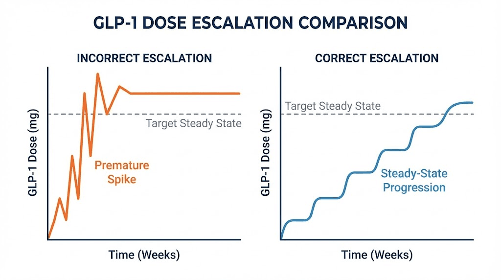
Mistake 1: escalating too early
This is the most common error. You start a dose, wait two weeks, feel nothing dramatic, and increase. The plotter shows in stark visual terms that you were only at 50-60% of steady state. The full effects of your starting dose never had a chance to manifest.
The fix is simple but requires discipline. Wait at least four weeks at each dose before evaluating effectiveness. The plotter gives you the visual patience tool: watch the curve climb toward its plateau and know that the plateau represents your dose's full potential.
Research confirms this approach. Clinical trials hold each dose for four weeks before escalation, and this is not arbitrary. It is based on the pharmacokinetics of reaching steady state.
Mistake 2: attributing transition spikes to the new dose
You increase from 5 mg to 7.5 mg of tirzepatide and experience severe nausea. You conclude that 7.5 mg is "too much" and drop back to 5 mg. The plotter tells a different story.
The nausea likely came from the temporary concentration spike during transition, where leftover medication from the 5 mg steady state combined with the first 7.5 mg dose to produce concentrations higher than either dose would produce alone at steady state. Had you waited through the transition (usually one to two weeks), the spike would have resolved and you would have settled into a comfortable steady state at 7.5 mg.
This does not mean you should ignore severe side effects. But it does mean that side effects during the first week or two of a dose increase are not necessarily representative of what that dose feels like at steady state.
Mistake 3: comparing medications at non-equivalent timepoints
Someone switches from semaglutide to tirzepatide and reports that tirzepatide "feels weaker" after two weeks. The plotter explains why. Semaglutide had been at steady state (100% of its full effect). Tirzepatide at two weeks is only at approximately 60-70% of its eventual steady state. The comparison is unfair because the two medications are at different points in their accumulation curves.
Any meaningful comparison between semaglutide and tirzepatide requires both to be at steady state. The plotter shows you exactly when that apples-to-apples comparison becomes valid.
Mistake 4: ignoring the trough
Many users focus exclusively on what happens after injection (the peak) and ignore the trough, the lowest point before the next dose. But the trough is arguably more important for sustained results.
If your trough drops below the therapeutic threshold for appetite suppression, you experience a mini withdrawal every week. Hunger returns. Cravings spike. Self-control becomes harder. Then you inject and the cycle repeats. The plotter shows whether your trough is adequate or whether you need a higher dose (to raise the entire curve) or more frequent dosing (to prevent the trough from dropping as far).
For semaglutide appetite suppression and tirzepatide appetite suppression, the trough level determines whether your appetite control is consistent all week or only present for a few days after injection.
Mistake 5: not accounting for missed doses
Life happens. You miss a dose. The question is: what do you do now?
The plotter shows exactly what a missed dose looks like in your concentration curve. There is a deeper-than-usual trough followed by a recovery period as the next dose begins rebuilding levels. It also shows that doubling up the next dose to "catch up" creates a dangerous spike that exceeds anything in your normal protocol.
The standard guidance is to take your next scheduled dose as normal and accept the temporary dip. The plotter confirms that a single missed dose does not reset your accumulation to zero. At steady state, missing one dose drops your trough from about 50% of peak (for semaglutide) to roughly 25%. That is significant but not catastrophic. Two consecutive missed doses, however, substantially erode your baseline, and the plotter shows just how much ground you lose.
The pharmacokinetic science that powers every plotter
Every GLP-1 plotter is essentially a visual front-end for a set of pharmacokinetic equations. Understanding the science behind those equations deepens your ability to interpret the output.
One-compartment model basics
Most plotters use a simplified one-compartment pharmacokinetic model. This treats your body as a single, well-mixed container. Medication enters (injection), distributes evenly throughout (absorption), and leaves at a rate determined by the half-life (elimination).
The reality is more complex. Your body has multiple compartments: blood, tissue, fat, organs. Medications distribute differently across these compartments, and the rate of distribution affects the concentration curve. But for weekly dosing of long-half-life medications like GLP-1 agonists, the one-compartment model produces curves that closely match actual measured blood levels. The simplification is justified by the pharmacokinetics.
The math behind accumulation
For the mathematically curious, here is what the plotter calculates.
After each dose, the concentration follows an exponential decay: C(t) = C0 * e^(-0.693 * t / t_half), where C0 is the peak concentration from that dose, t is time since injection, and t_half is the half-life.
For repeated doses, the plotter sums the contributions from every previous dose. At any point in time, your total concentration is the sum of all previous doses, each decayed by the appropriate amount of time since it was administered.
At steady state, this sum converges to a predictable range. The accumulation ratio (the factor by which steady-state levels exceed single-dose levels) equals 1/(1 - e^(-0.693 * dosing_interval / t_half)). For semaglutide dosed weekly with a seven-day half-life, this works out to approximately 2.0. For tirzepatide with a five-day half-life, approximately 1.7. For retatrutide at six days, approximately 1.85.
These numbers mean that your steady-state trough is roughly 2x (semaglutide), 1.7x (tirzepatide), or 1.85x (retatrutide) what a single dose would produce after seven days. The plotter handles all this math automatically. But knowing it exists helps you understand why the curves look the way they do and why accumulation follows such predictable patterns.
Bioavailability and absorption rate
Two additional factors influence what the plotter shows.
Bioavailability determines what percentage of the injected dose actually reaches systemic circulation. For injectable semaglutide, that is approximately 89%. For tirzepatide, about 80%. These numbers are baked into the plotter's calculations for injected medications.
Oral semaglutide is a different story entirely, with bioavailability around 1%. This means oral formulations require much higher nominal doses to achieve similar blood levels. A plotter designed for injectable semaglutide will not accurately model oral administration. Make sure you select the correct formulation if your plotter offers that option.
Absorption rate determines how quickly the injected dose enters the bloodstream. This affects the peak timing. Injection site matters here. Subcutaneous injections in the abdomen tend to absorb faster than those in the thigh. The plotter cannot account for injection site variation, but knowing it exists helps explain why your peak might arrive slightly earlier or later than the graph predicts.
Individual variation and plotter limitations
Every plotter uses population-average pharmacokinetic parameters. Your actual half-life might be 6.2 days instead of the average 7 days for semaglutide. Your clearance rate might be slightly faster or slower than average.
Factors that influence individual pharmacokinetics include body weight (larger individuals may have slightly different volume of distribution), kidney function (impaired renal function can slow elimination), age (elderly patients sometimes show slower clearance), and concurrent medications (though GLP-1 agonists have relatively few pharmacokinetic drug interactions).
The plotter output is therefore a best estimate, not a precise measurement. It shows you the expected behavior for an average person taking your dose and schedule. Your actual curve might be shifted slightly left or right, higher or lower. But the shape, the accumulation pattern, the relative timing of peaks and troughs, these remain accurate enough to guide practical decisions.
Think of it like a weather forecast. It tells you whether to expect sun or rain, even if the exact temperature might be off by a degree or two. That level of accuracy is more than sufficient for protocol planning.
Practical protocols informed by plotter data
Here are specific protocol strategies that plotter data supports, complete with the pharmacokinetic reasoning behind each one.
Protocol 1: the slow and steady semaglutide escalation
Goal: Minimize side effects while reaching effective therapeutic levels
Schedule:
Weeks 1-6: 0.25 mg weekly (extended from standard 4 weeks)
Weeks 7-12: 0.5 mg weekly (extended)
Weeks 13-16: 1.0 mg weekly
Weeks 17-20: 1.7 mg weekly
Week 21+: 2.4 mg maintenance
Why the plotter supports this: By extending the initial low-dose phases to six weeks instead of four, you ensure complete steady state establishment before escalation. The plotter shows that at four weeks, you are at approximately 94% of steady state. At six weeks, you are at 98%. That extra 4% might seem trivial, but it means your body has fully adapted to the current concentration before you ask it to handle more.
This protocol is particularly suitable for people who are sensitive to semaglutide fatigue or gastrointestinal effects, and for those using semaglutide with B12 or semaglutide with glycine to mitigate side effects.
Protocol 2: the tirzepatide micro-step escalation
Goal: Avoid the dramatic side effects common with standard 2.5 mg escalation jumps
Schedule (compounded tirzepatide required):
Weeks 1-4: 2.5 mg weekly
Weeks 5-8: 3.0 mg weekly
Weeks 9-12: 3.75 mg weekly
Weeks 13-16: 5.0 mg weekly
Weeks 17-20: 6.25 mg weekly
Weeks 21-24: 7.5 mg weekly
Continue escalating by 1.25-2.5 mg every 4 weeks as needed
Why the plotter supports this: The standard jump from 2.5 mg to 5 mg produces a transition spike where your first-week peak at 5 mg can exceed the eventual 5 mg steady-state peak by 15-25%. The micro-step approach, visible on the plotter as a gentler incline rather than sharp staircase, keeps transition spikes below 10% of steady-state peaks. The result is fewer side effects, better adherence, and paradoxically faster progress because you never need to take time off or drop back a dose.
This is where tirzepatide with glycine and tirzepatide with B12 formulations add extra value, since the added compounds support tolerance during escalation while the plotter tracks the pharmacokinetic progression.
Protocol 3: the twice-weekly split dose approach
Goal: Flatten the concentration curve to eliminate end-of-week symptom return
Schedule (any compounded GLP-1):
Take half your weekly dose every 3.5 days (e.g., Monday morning and Thursday evening)
Total weekly dose remains identical
Escalate total weekly dose at the same rate as your original plan
Why the plotter supports this: The plotter shows a dramatic difference between once-weekly and twice-weekly dosing curves at the same total weekly dose. Peak-to-trough ratio drops by approximately 30-40%. This means less nausea at peak, more consistent appetite suppression at trough, and a generally smoother experience throughout the week.
The trade-off is twice as many injections. For people who find injections uncomfortable, this might not be worth it. But for those struggling with muscle pain at peak or appetite return before their next dose, the plotter data strongly supports this approach.
Protocol 4: the medication transition plan
Goal: Switch between GLP-1 medications without losing coverage or creating dangerous overlap
Schedule (example: tirzepatide to semaglutide):
Take last tirzepatide dose on day 0
Begin semaglutide at starting dose (0.25 mg) on day 7
Follow standard semaglutide escalation from there
Why the plotter supports this: The plotter shows that seven days after your last tirzepatide dose, approximately 38% remains in your system. Starting low-dose semaglutide at this point adds only a small amount of additional GLP-1 receptor activation. As tirzepatide continues to decay over weeks 2-4, semaglutide simultaneously builds. The plotter reveals a smooth handoff where total GLP-1 activity never drops dramatically and never spikes dangerously.
The switching dosage chart and dose conversion chart resources provide the dosage guidance that complements the plotter's visual timeline.
Interpreting your plotter results
You have your graph. Now what? Here is how to extract actionable information from the visual data.
Reading the accumulation phase
During your first 4-5 weeks at any dose, the curve should show progressively higher peaks and progressively higher troughs. Each week, both values increase, but the rate of increase slows. This deceleration is normal. It is the mathematical consequence of approaching a limit (steady state).
If you are at week three and your trough is roughly 75% of what the plotter predicts for your steady-state trough, you know the medication is on track but not yet at full effect. This is valuable information because it prevents premature dose changes.
Reading the steady-state phase
Once you have been at a consistent dose for 4-5 weeks, the plotter curve should show a repeating pattern. Same peak height. Same trough depth. Week after week.
If you are experiencing consistent side effects at steady state (not just during the transition), that tells you the dose itself is probably too high for your tolerance, not that you are going through a temporary adjustment period. This is when a dose reduction or dose splitting conversation becomes appropriate.
Conversely, if you are at steady state and experiencing no therapeutic benefit (no appetite change, no metabolic effects), the plotter confirms that the dose has had its full chance. It is appropriate to escalate.
Reading transition periods
Every dose change creates a 4-5 week transition period where the old steady state decays and the new one builds. The plotter shows this as a brief spike followed by a new accumulation phase.
Side effects during this transition are expected. They do not represent what the new dose will feel like at steady state. The plotter gives you a visual timeline for when the transition resolves, letting you mentally frame temporary discomfort as exactly that: temporary.
Red flags on the plotter
A few patterns that warrant attention.
If your symptoms worsen progressively over weeks despite being at a stable dose and past the transition period, something beyond simple pharmacokinetics may be at play. The plotter should show flat, stable concentrations at this point. Worsening symptoms in the face of stable concentrations suggest other factors (diet changes, stress, concurrent illness) are contributing.
If you see dramatic swings in your plotter because of inconsistent dosing times (injecting three days late one week, two days early the next), the uneven peaks and troughs explain inconsistent effects. The fix is straightforward: pick a consistent day and time for injections.
GLP-1 plotters and microdosing
The microdosing trend has created a natural synergy with GLP-1 plotters, because microdosing is all about precision at the margins.
What microdosing looks like on the plotter
Microdosing typically involves using 10-25% of a standard therapeutic dose. For semaglutide, that might mean 0.05-0.125 mg weekly instead of the standard 0.25 mg starting dose. For tirzepatide, perhaps 0.5-1.25 mg instead of 2.5 mg.
On the plotter, microdose curves show the same accumulation pattern as standard doses, just at lower absolute concentrations. Steady state still takes 4-5 weeks. The sawtooth pattern still appears. But the entire curve sits lower on the graph.
The value of the plotter for microdosing is that it reveals just how low the concentrations actually are. Some people microdose and expect standard-dose results faster. The plotter shows in concrete visual terms that a microdose at steady state achieves concentrations that a standard dose produces within its first week. This can recalibrate expectations and help microdosers understand that while their approach minimizes side effects, it also significantly extends the timeline to therapeutic levels.
The accumulation argument for microdosing patience
Here is something counterintuitive that the plotter makes obvious. Even at very low doses, consistent daily or weekly dosing produces accumulation. A microdose that seems trivially small after one injection becomes pharmacologically relevant after four to five weeks of accumulation.
This is particularly important for the growing community of researchers exploring GLP-1 microdosing for metabolic benefits without the dramatic appetite suppression and weight loss that higher doses produce. The plotter shows that patience is not just a virtue in microdosing. It is a requirement. The compound must accumulate to reach even its reduced target concentration.
Diet, lifestyle, and the plotter
The plotter does not exist in a vacuum. Lifestyle factors interact with the pharmacokinetic curve to determine your actual experience.
Timing meals around concentration peaks
If you inject on Monday morning and your medication peaks around Tuesday or Wednesday, those are the days when appetite suppression is strongest. Strategic meal planning means accepting that Tuesday might be a naturally lighter eating day while Friday or Saturday (approaching the trough) might require more deliberate portion control.
The plotter identifies these patterns. Knowing when your peaks and troughs occur lets you plan what to eat and when, rather than fighting against the pharmacokinetic tide.
Exercise timing and medication levels
Some users report exercise-related nausea when training at peak medication levels. The plotter helps you identify whether your gym schedule coincides with concentration peaks. If it does, shifting your workout to a trough day (day six or seven of your weekly cycle) might resolve the issue without any medication changes.
Alcohol and the concentration curve
Users exploring alcohol consumption on semaglutide or alcohol on tirzepatide should understand that the medication's effects on gastric emptying are strongest at peak concentration. Drinking alcohol near your peak can intensify both medication side effects and alcohol effects due to delayed absorption. The plotter identifies your peak window so you can make informed timing decisions.
Supplement interactions
Many GLP-1 users take concurrent supplements. B12, glycine, and niacinamide are among the most popular. While these supplements do not change the pharmacokinetic curve on the plotter, they can influence how you experience that curve. B12 may help with energy during trough periods. Glycine may support GI tolerance during peaks. Niacinamide may address certain metabolic effects.
The plotter helps you correlate supplement timing with your concentration curve. If B12 helps most during trough periods, take it on days five through seven. If glycine reduces peak-related nausea, take it on days one through three. The plotter gives you the pharmacokinetic map. Your supplement strategy fills in the territory.
Storage, reconstitution, and the connection to accurate plotting
A plotter is only as accurate as the doses you input. And your doses are only as accurate as your reconstitution process.
Why accurate reconstitution matters for plotter accuracy
If you are using compounded vials, the concentration of your reconstituted solution determines how many units you draw for each dose. An error in reconstitution, using too much or too little bacteriostatic water, cascades through every subsequent dose. Your plotter shows a perfect curve assuming your stated doses are accurate. But if your reconstitution was off by 20%, every dose you log is 20% off in reality.
Use the peptide reconstitution calculator to get your ratios right. For 5 mg semaglutide vials, follow precise mixing instructions. For tirzepatide reconstitution, the process is equally critical. And for retatrutide, check the reconstitution chart before mixing.
Storage and potency over time
Proper refrigerated storage maintains medication potency. If your vial has been sitting at room temperature for extended periods, or out of the fridge for too long, potency may degrade. A degraded medication delivers less active compound per unit drawn, which means your plotter overestimates your actual blood levels.
Similarly, expired tirzepatide or expired semaglutide may have reduced potency. The plotter cannot account for degradation, so ensuring your medication is properly stored and within its use-by date is a prerequisite for accurate tracking.
SeekPeptides provides comprehensive storage guides and shelf life information that help ensure the doses you track match the doses your body actually receives.
Combining plotters with other GLP-1 tools
The plotter is most powerful when used alongside other tools in your GLP-1 management toolkit.
Dosage calculators
Before you can plot a dose, you need to know the correct dose amount. Semaglutide dosage calculators and tirzepatide dosage calculators help you convert between milligrams, units, and milliliters based on your vial concentration. Get the conversion right, log the correct milligram value in your plotter, and the concentration curve will be accurate.
Conversion charts
If you are switching medications or comparing protocols, conversion charts tell you the dose equivalencies. A plotter then shows you how those equivalent doses compare in terms of concentration curves, peak-to-trough ratios, and time to steady state.
Reconstitution charts
Accurate reconstitution is the foundation of accurate dosing, which is the foundation of accurate plotting. The semaglutide reconstitution chart, tirzepatide reconstitution chart, and retatrutide reconstitution chart ensure your mixing ratios produce the intended concentration. One wrong step here throws off every subsequent calculation.
Diet and meal planning guides
Combine your plotter data with semaglutide diet plans, tirzepatide diet plans, and food guidance to align your nutrition with your pharmacokinetic curve. Peak days favor lighter meals. Trough days might need more deliberate protein and nutrient focus.
The SeekPeptides toolkit
For researchers serious about optimizing their GLP-1 protocols, SeekPeptides brings together the peptide calculator, reconstitution calculator, cost calculator, and comprehensive protocol guides in one platform. Members access detailed dosing protocols, stacking guidance, and a community of experienced researchers who have navigated the same questions you are facing. The plotter provides the pharmacokinetic data. SeekPeptides provides the context to use it wisely.
Safety considerations and disclaimers
A GLP-1 plotter is an educational and planning tool. It is not a diagnostic device or a substitute for medical supervision.
What the plotter cannot tell you
It cannot measure your actual blood levels. Only laboratory testing can do that. The plotter estimates population-average concentrations based on published pharmacokinetic data. Your individual curve may differ.
It cannot predict side effects. Two people at identical concentrations may have completely different experiences. The plotter shows concentration. Your body determines the response.
It cannot diagnose problems. If you are experiencing concerning symptoms, consult a healthcare provider. The plotter might help you have a more informed conversation, but it does not replace clinical assessment.
When to consult a healthcare provider
Always consult a healthcare provider before starting, stopping, or changing the dose of any GLP-1 medication. The plotter helps you understand what changes look like pharmacokinetically, but the decision to make those changes should involve professional guidance.
Specific situations that warrant immediate medical attention regardless of what the plotter shows include severe or persistent nausea and vomiting that does not improve within 48 hours, signs of pancreatitis (severe abdominal pain radiating to the back), allergic reactions (rash, difficulty breathing, swelling), significant changes in vision, and any symptom that feels medically emergent.
The plotter is a planning tool, not a safety net.
Compounded medication considerations
Compounded GLP-1 medications are not FDA-approved products. Their safety, efficacy, and quality have not been verified through the FDA approval process. The plotter assumes that your compounded medication contains the stated amount of active ingredient at the stated potency. If the compounding pharmacy's product deviates from its label, plotter accuracy decreases accordingly.
This is not an argument against compounded medications. It is an argument for using reputable compounding pharmacies with third-party testing and quality certifications. The better your medication quality, the more accurately the plotter reflects your actual pharmacokinetic experience.
Frequently asked questions
How accurate is a GLP-1 plotter?
GLP-1 plotters use published pharmacokinetic data from clinical trials and FDA documentation. They provide population-average estimates, meaning the curves are accurate for the "typical" person but may not precisely match your individual experience. Factors like body weight, kidney function, metabolism, and injection site can shift your personal curve. Think of plotter accuracy like a weather forecast: reliable for planning, but not a guarantee of exact conditions. For most users, the plotter's predictions align closely enough with real-world experience to guide protocol decisions effectively.
Can I use a GLP-1 plotter for oral semaglutide?
Most plotters are designed for injectable formulations. Oral semaglutide has dramatically different pharmacokinetics, with only about 1% bioavailability compared to 89% for injections. The half-life is similar (approximately one week), but the within-dose bioavailability variation is much higher at 137% per dose. Some plotters include oral semaglutide as an option with adjusted parameters. If yours does not, using an injectable semaglutide model for oral formulations will produce inaccurate results. Always verify that your plotter supports your specific formulation.
How long should I wait at each dose before the plotter shows steady state?
The standard pharmacokinetic rule is 4-5 half-lives for steady state. For semaglutide (7-day half-life), that is 28-35 days. For tirzepatide (5-day half-life), 20-25 days. For retatrutide (6-day half-life), 24-30 days. The plotter shows this progression visually. When the peaks and troughs stop climbing and settle into a repeating pattern, you have reached steady state. Most healthcare providers recommend waiting at least four weeks at each dose before evaluating effectiveness or escalating.
What does it mean if I feel effects wearing off before my next dose?
This typically indicates that your trough concentration drops below your personal therapeutic threshold. The plotter shows the magnitude of the peak-to-trough decline. Solutions include increasing the dose (raising the entire curve including the trough), splitting the dose into twice-weekly injections (reducing the trough depth while maintaining the same total weekly dose), or switching to a medication with a longer half-life (semaglutide troughs are shallower than tirzepatide troughs due to its longer half-life).
Should I use the plotter to adjust my own doses?
The plotter is an informational tool, not a prescribing device. Use it to understand your pharmacokinetics, plan conversations with your healthcare provider, and visualize the impact of proposed changes. Do not use it as the sole basis for dose modifications. Always discuss changes with a qualified medical professional who can account for your complete health picture, including factors the plotter cannot model like your medical history, concurrent medications, and lab results.
Can plotters model combination therapies?
Some advanced plotters allow you to plot multiple compounds simultaneously. This is useful for visualizing transitions between medications or for understanding how combination protocols like cagrilintide with semaglutide layer their concentration curves. However, plotters model each compound independently. They do not account for pharmacodynamic interactions, meaning they show you what the concentration levels are but not how two compounds interact at the receptor level.
Do I need a plotter if I use branded pen injectors?
Branded pens (Ozempic, Wegovy, Mounjaro, Zepbound) have fixed dose increments and come with manufacturer-provided escalation schedules. A plotter is still useful for understanding why each dose step takes four weeks, visualizing what happens if you miss a dose, and planning for dose transitions or medication switches. The plotter adds understanding to the process, even when the dosing decisions are predetermined by the pen's design.
What is the best GLP-1 plotter for beginners?
GLP1Calculator.com offers the most beginner-friendly experience with its educational guide section that explains pharmacokinetic concepts alongside the plotter tool. GLP1Plotter.com from the Reddit community is the most widely used and has strong community support. For retatrutide users specifically, GLP3Planner.com provides the most dedicated resources. Start with whichever plotter supports your specific medication, then explore others as your understanding grows.
External resources
PubMed: Pharmacokinetics and clinical implications of semaglutide
NCBI StatPearls: Tirzepatide pharmacology and pharmacokinetics
New England Journal of Medicine: Retatrutide phase 2 trial data
PMC: Clinical recommendations for managing GLP-1 GI adverse events
For researchers committed to mastering their GLP-1 protocols with precision, SeekPeptides provides the most comprehensive resource available. Members access evidence-based protocol guides, advanced dosing calculators, detailed pharmacokinetic references, and a community of thousands who have navigated these exact questions with data-driven approaches.
In case I do not see you, good afternoon, good evening, and good night. May your concentration curves stay smooth, your steady states stay stable, and your protocols stay precisely on target.